Creating a focal point in any room is a key point of any interior home styling. Packing a space with a variety of wow items is a temptation, but it is also a risk. Not only does a well-put-together mantel provide you with the perfect place to play around with different pieces, but for creating an awe-inspiring focal point.
But creating a contemporary mantel can be tricky. If you overload it with accessories, it can quickly look overstuffed and challenge the eye. Keep it too plain, and a mantel could seem boring. That’s why bringing together the perfect balance of simplicity and uniqueness is how our interior designers style their professionally-crafted mantel designs.
We asked these professionals from San Francisco Design, how they help their clients create a contemporary mantel. Here are the top elements they include in any mantel design that keeps every space looking fresh and exciting.
Tip #1: Focus on a WOW Item
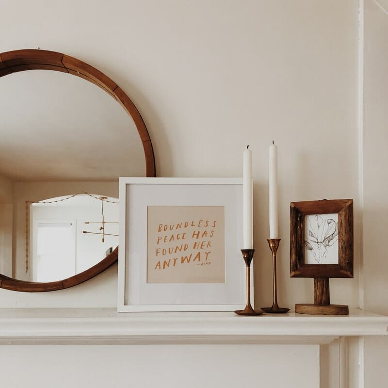
The best way to start styling your mantel is by finding an item to focus on in your design. Whether it’s your favorite piece of artwork, a mirror, or a television, choosing one larger piece to center your design will make any mantel look professionally put-together. It is also great to include artwork that is special to you, even if you have had it for years. Adding it to your freshly-styled mantel will make the piece look brand new.
Mirrors are also an excellent option for many homeowners as they open up space. Perhaps one of the biggest perks of using a mirror is that it helps the room appear even bigger than it already is. You can find a mirror that is round, rectangular, framed, or plain. Whichever option you choose, it will make a great focal point in your space.
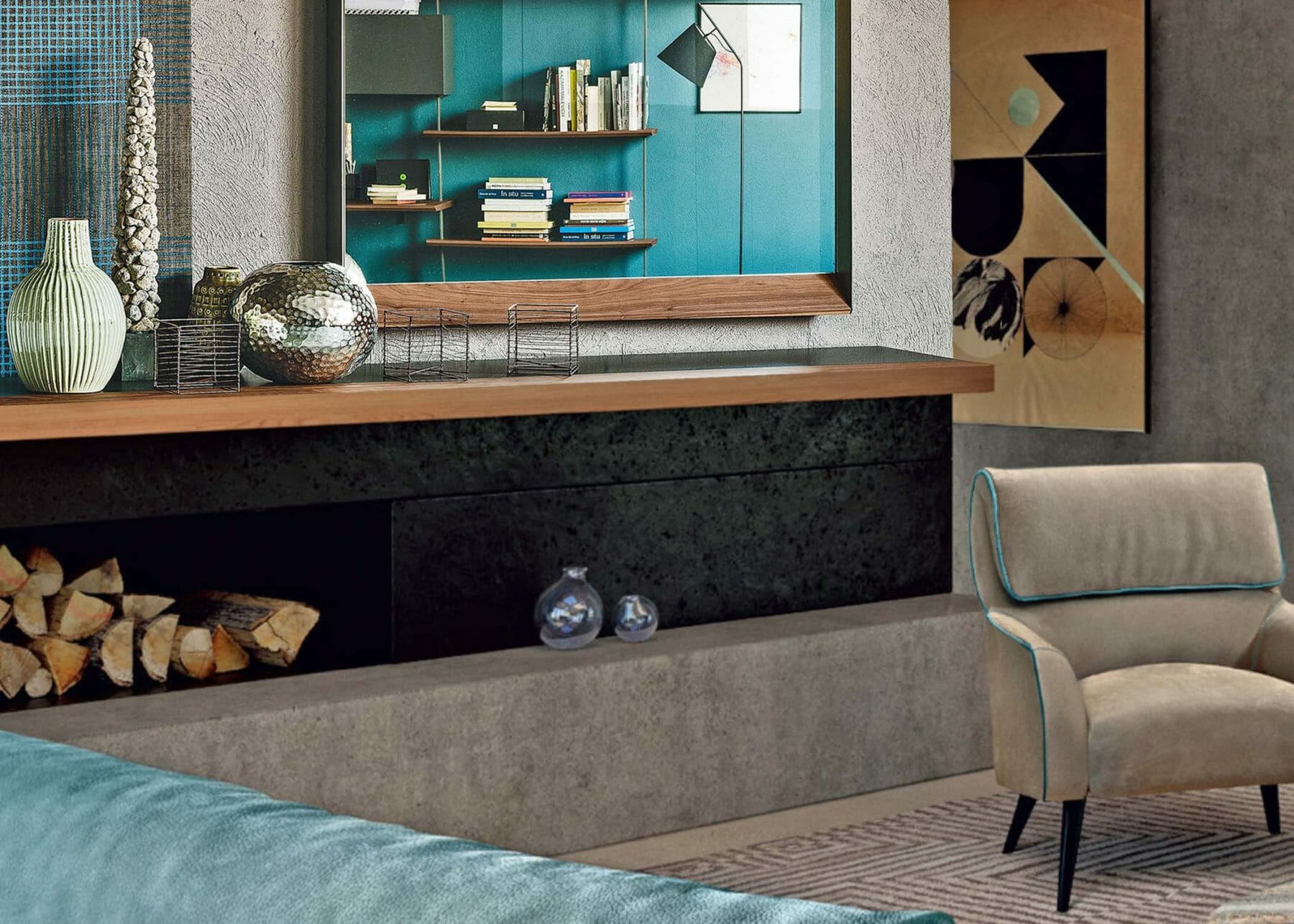
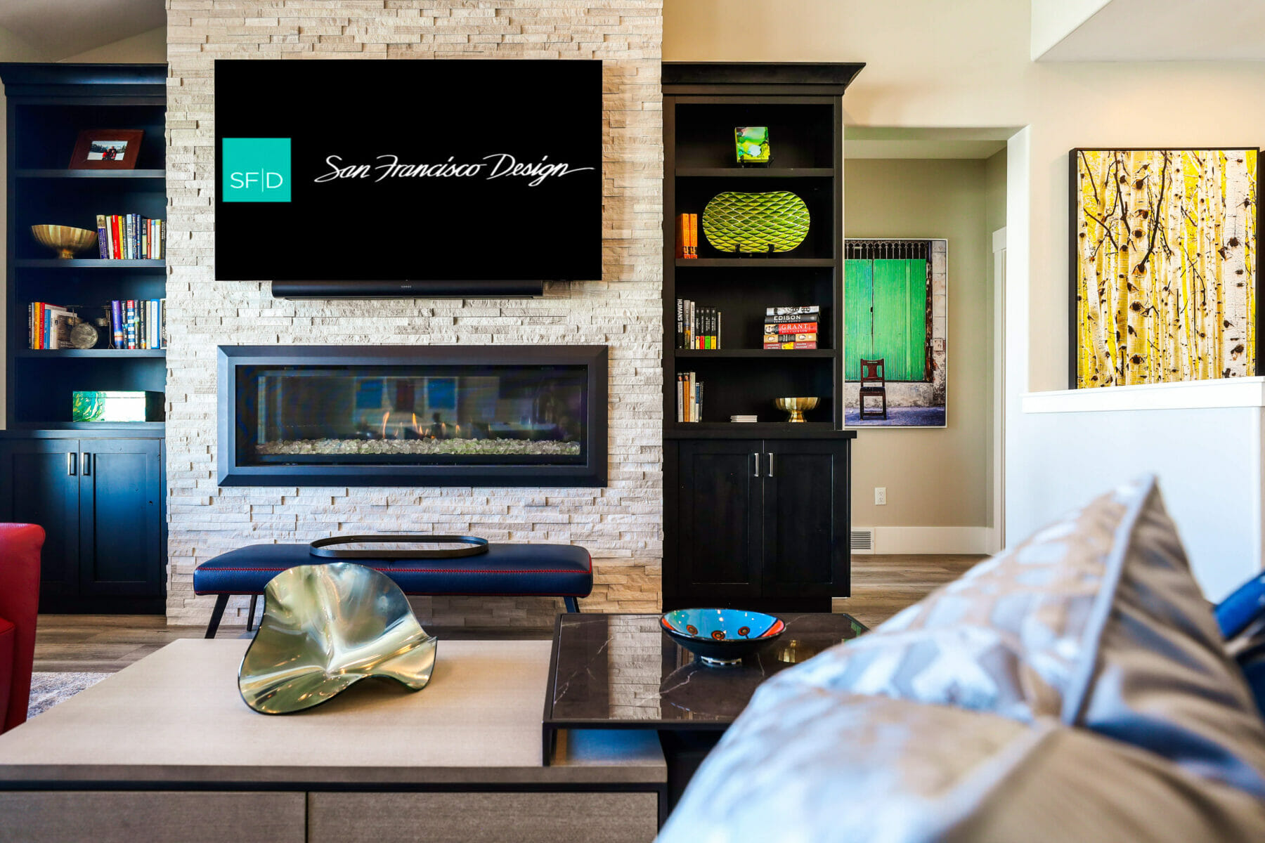
Televisions are another popular choice for homeowners. Some believe it will cheapen their design, but with the right styling, it will look just as contemporary as any mantel without one. Just take a look at the design featured in the picture above, where a framed TV actually brings the entire mantel design together. Don’t be afraid—grab your flat-screen TV and let it take center stage on your mantel.
Tip #2: Add a Few Containers
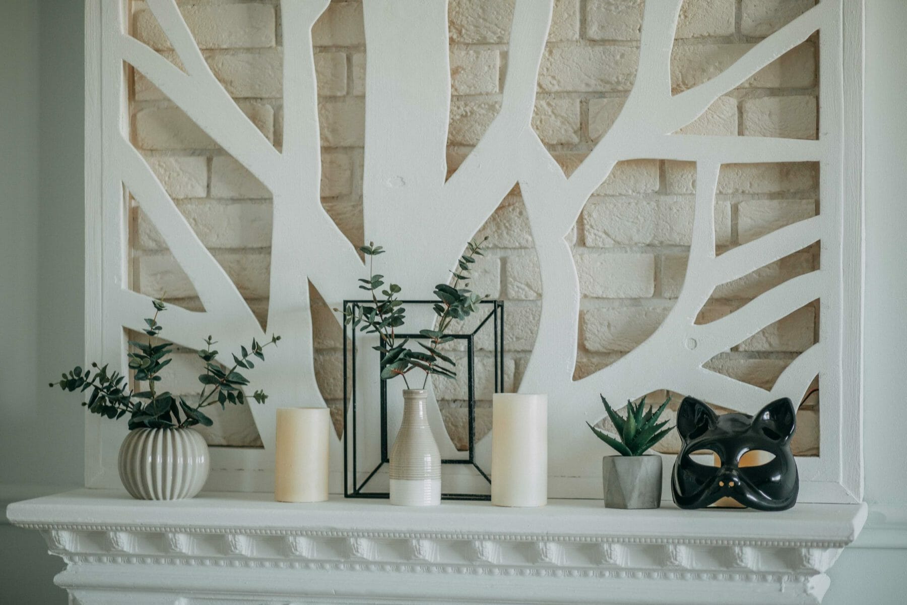
Smaller containers that fit on a mantel help add complexity to the design. Containers work well standing on their own, but are even better when filled with greenery or fresh flowers. You can also find a variety of small containers like patterned boxes and stack them on top of each other. These will add some complexity that every professionally-designed area needs.
Tip #3: Create Levels
Another element to a beautifully-styled mantel is creating levels to the design. Pick items that feature different heights and layers. If you use accessories that are one height, your mantel will look simple, no matter how many things you use. Use books, candles, vases, and mirrors that vary in size, shape, and height. Together, it will give them plenty to look at, so it stays interesting no matter how long you look at it.
Tip #4: Add in Smaller Accessories
No mantel is complete without a collection of unique accessories. Our designers suggest leaving this tip for the last step of your design. That way, you can find the spaces in your mantel that need something extra. You should also opt for items that are special to you, whether it is picture frames, keepsakes collected on memorable trips, or accessories that match your personality.
However, keep your mantel accessories to a minimum. The more you add, the more eclectic your mantel will look. Our interior designers use contemporary design rules and only suggest featuring 2-3 smaller items.
Contemporary Mantel Styling at San Francisco Design
If you need help designing your living space, San Francisco Design is here to help. Our contemporary interior designers know how to make any mantel look perfectly put together. Contact us to learn more about our interior design services. You can also browse our site for a variety of contemporary items, accessories, and larger furniture pieces that you can use in your home.

